Substance Painter stylized edge highlight generator

Making Of / 19 April 2024

Here's a look at a Substance Painter stylized edge highlight generator I developed for my work at Lightforge Games 🔅


The filter is based on the baked curvature & opacity map of the mesh. This has been a huge timesaver when texturing props & characters and helped us to keep the look consistent across assets.

Might do a full breakdown of this later if people are interested :)


How to make tadpole friends

Making Of / 04 August 2021

Sooo - all the assets in my project are done!! The last thing was to make those little tadpole friends.

For the stylization I was inspired by work by Lianne Pflug & EllievsBear.

Early on in the project I decided to have the tadpoles to be the greatest point of (value) contrast in the scene. Having those white eyes contrasted with the black body creates a really strong focal point + gives them a sense of mystery (while still being cute).

Another thing that was important to me was to simplify the shapes, have a limited color palette and give them a round/friendly look.


I first used Blender's Metaballs to block in the basic shape (which gives it that soft, organic look).


After that I tweaked the shape with the Grab brush.

I have two versions of the tadpole to reflect the topic of transformation in my scene :)

Lastly I retopo-ed the tadpoles with RetopoFlow (Blender Addon) to be able to deform the tail later + added a brush pattern + edge highlight as with the other assets. First time using RetopoFlow & I love-hate it. Quick & intuitive buuut, the knife tool and other stuff is very crash-y (at least in the Github version).


Concepting Portfolio Pieces & Using Foliage to Tell Stories

Making Of / 31 May 2021

Hi all! Here is a useful look into the process for my thesis.

Concepting a Portfolio Piece

First off, in case you don't know it yet, Miro is great for creating moodboards!

Besides collecting reference, you can also make mindmaps + Kanban boards, etc. with it. Plus you can collab real-time with others similar like Google Docs.

For the main reference I looked at the following categories:
  • Key References
  • Style
  • Lighting
  • Benchmark (in my case from companies I wanna work for)
  • Composition (not pictured in screenshot)

Style can be left out for some projects I'd say! But for this I'm also developing the art style, so it was important to include.

I included a key image and preliminary color palette in most of the boards (got this trick from Polygon Academy).

Benchmark is both useful to see if my work meets the quality of people working in the industry + to see if my work fits in stylistically w/ the companies I want to work for.

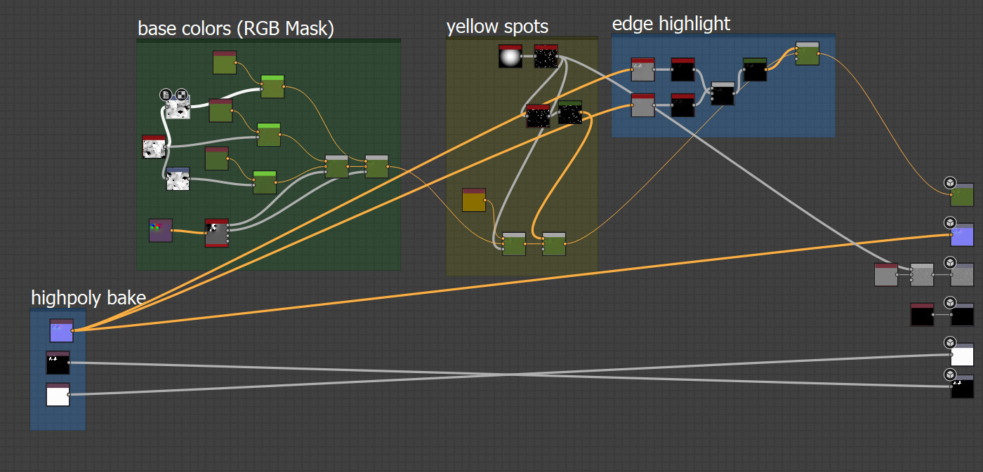
Playing with Unity HDRP

One thing I learned from collecting reference from companies I'd like to work for, is that almost all of them use Unity!

So I decided to go with Unity for this project, altho I'm really tempted to switch now that UE 5 is available.

HDRP has this really cool Iriscadence option by default (as seen in the video).

I decided to go with a "traditional" fish bowl instead of a cylindrical vase because:

  • it's familiar
  • it has round & organic shapes (and I want things to feel very natural)

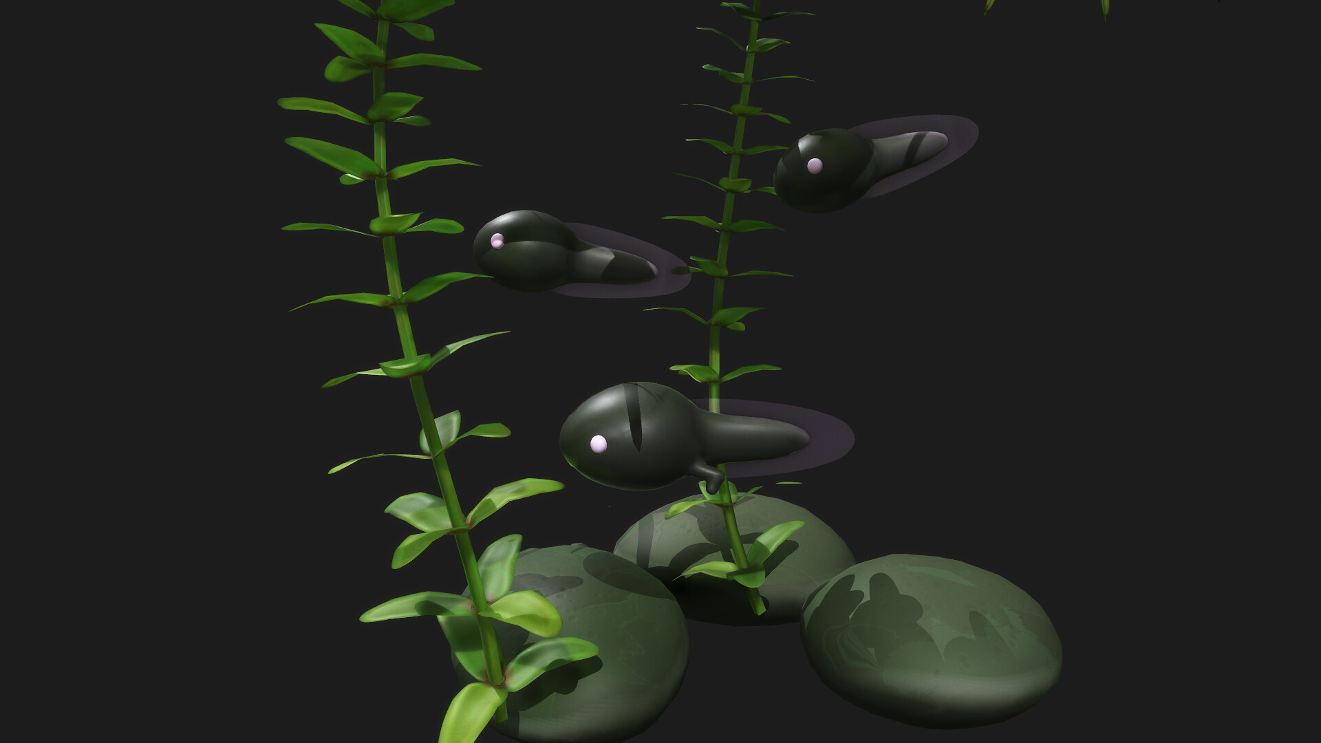
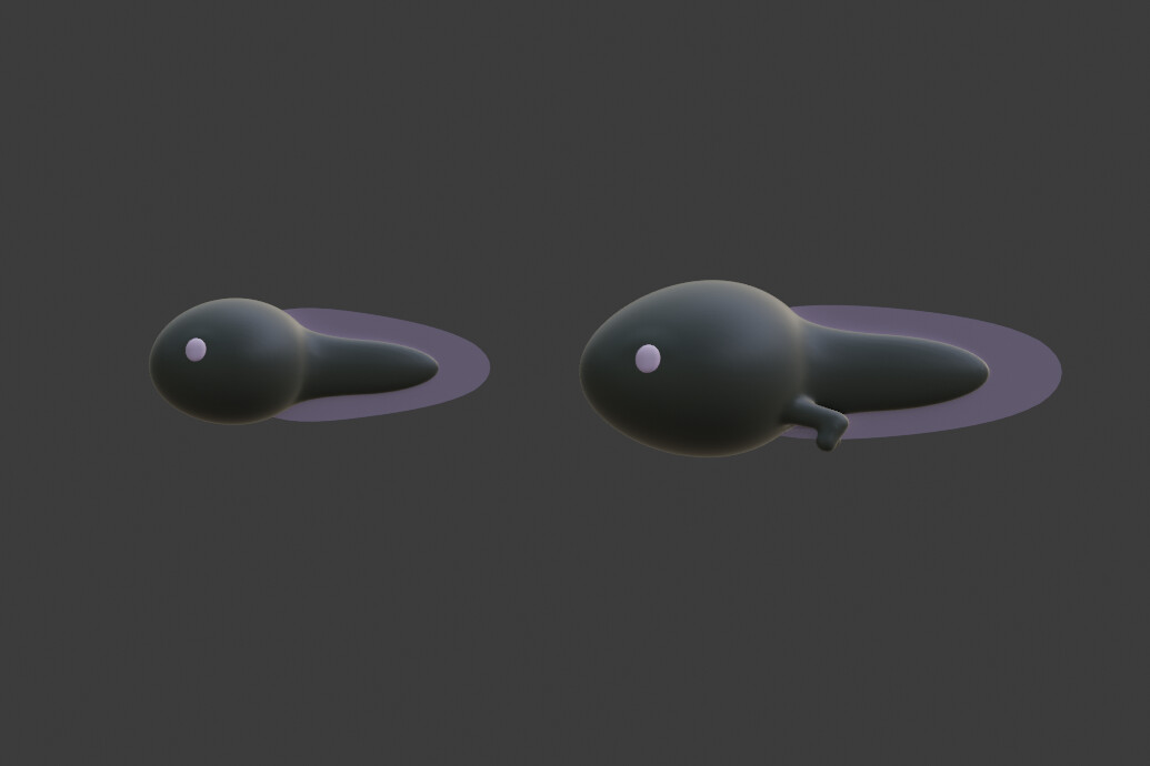
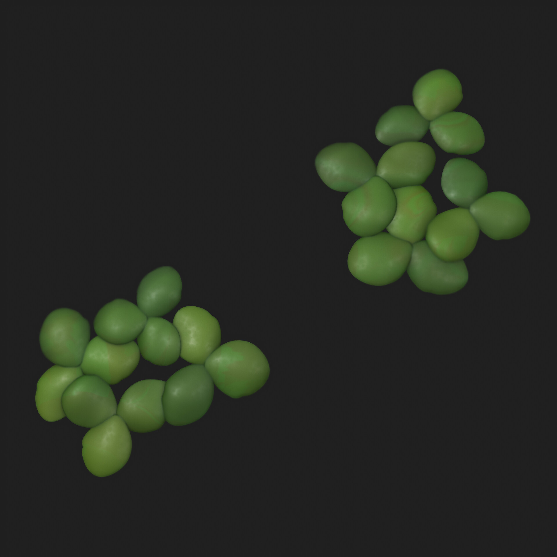
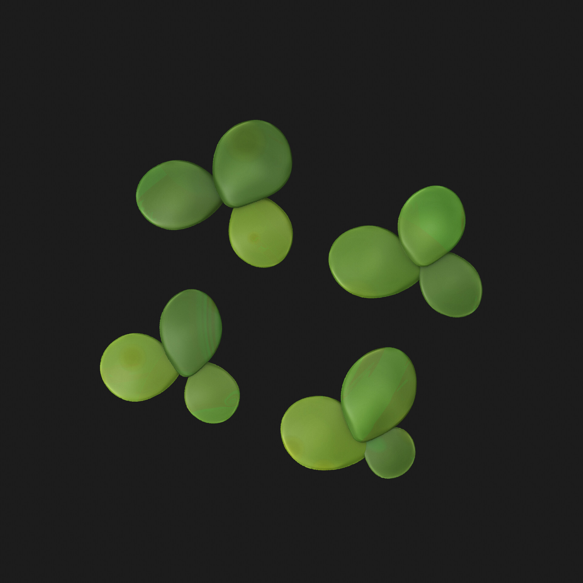
Composition & Foliage!

This fish bowl will be filled with underwater plants + tadpoles. A cool thing I learned is how foliage can support the narrative you tell!  There is this really interesting article by Jeremy Huxley who did foliage for Uncharted 4 among other things.

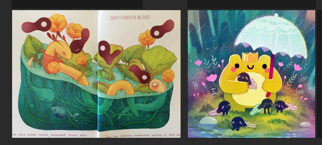
Here is the narrative/ themes I want my scene to communicate:

And here is how that narrative (of transformation/ change) is supported by the foliage:Also I was so happy to find that image on the right! It was so hard to find any aquariums with a composition that reads well as a 2D image.

I picked this one cause it has a nice combination of leading lines, framing and clear focal points.

So with those questions cleared I picked some plants that support the narrative I want to tell!

They are all native plants where I live, which was sth. that is important to me :)

Hope this was useful, feel free to let me know your thoughts.

Next up

  • create blockout
  • practice stylized sculpting
  • sculpt central branch
      

My Stylized Foliage Workflow

Making Of / 14 May 2021

Here's the current workflow I use for the foliage (Blender +  Substance Designer):

I wanted something that looks simple & cute!

And here's a look at the Substance Designer Graph:

The brush pattern is based on Vincent Dérozier's work, see this post for a how-to. For the color I use LT Color Dynamic to simplify the process & make it more predictable. And I also use EZSplatter to distribute the yellow-ish spots. The edge highlight is done via Curve Smooth and Curve Sobel :)


My first try this week looked like this:

I found it was a bit too undefined & looked more disgusting than cute. I solved this by scraping the edges of the highpoly & generally pushing the shapes a bit. Also I edited the roughness (a lot of "disgust" I think came from that) + added edge highlights to further highlight the shapes & create a clearer look.

The colors have stayed the same.

Next Steps

  • complete atlas & build duckweed lowpoly assets (they will be seen up close, as the game world is a glass jar)
  • continue learning Unity shader graph (so I can later make underwater shaders for the the project etc.)

Here's how the atlas currently looks (still need to add the roots + the leaf underside):

Thanks for looking! I have an Instagram now if you'd like to see WIP art and breakdowns: @tinymoss.

Substance Designer Learnings - From Making a Cake

Making Of / 02 June 2020
Here's some tips/takeaways from the last Substance Designer materials I made for the Mayterials challenge.

First have some cake :)

This was a great opportunity to re-use the strawberry material I had made before.

One thing that helps selling the gelatine cover on top is blurring the lower parts of the strawberries with a non-uniform blur. Think that's also great for puddles etc.!

Also height blend was really useful for blending all the different materials together for this! Plus it gives you a really handy mask (I added the blend node to show you the mask).


  Also I made this simple alien runes/ glyph generator!

Here's how it works.

The tile samplers are offset so that they fill in the spaces in between the square grid. I use a perlin noise to drive which places get filled in, so that it feels like it has more structure to it.

I experimented a bit on what it could be used for. Ended up making sort of a temple floor pattern/ mosaic with it :) (2 glyphs, each in a different shape mapper).

Hope this was interesting! Thanks for looking :)


Substance Designer Challenge: Mayterials - First 3

Making Of / 07 May 2020

Hi all! Here's my first 3 days from the Mayterials challenge! All Substance Designer & projected onto a flat plane.

Great art challenge if you want to practice some Substance Designer (or other procedural material generation).

Day 1: Honeycomb Pattern (theme:nature)

Things I learned:

  • Revisited Daniel Thigers awesome material rendering guide
  • Can use circles with different blur amount in diffuse to simulate small bubbles below (see screenshot)


Day 2: Living Starfish (theme:beach)

Things I learned: 

  • Using the curve node to create profiles for the spikes
  • also just how crazy alive starfish can look!


  Day 3: Little Strawberry (theme: harvest)

Things I learned:

  • using low focal length + Depth of Field to fake perspective during rendering
  • don't blend in straight lines for organic stuff, it'll look off (e.g. slight green gradient from the top has a directional warp)

Mayterials Challenge

If you want to participate in the challenge yourself, you can check out the Twitter or Discord. While prompts are daily, you can also chose to participate however often you want, based on your own schedule :) I did the first days daily but will do the rest 1-2 times a week.


 Â